
AI Auto-Fill UX: Why the Confirm Step Stays in Claimly
Claimly scans a receipt, sends it to a model, and comes back with the product name, the store, the purchase date and the total already filled in. The obvious next move is to save it — the whole point of scanning is not to type. We do not save it. The app shows you the extracted values on a review screen and waits for you to confirm.
That looks like a wasted tap, and people ask about it. The short answer: the confirmation step is not there because we distrust the model. It is there because of when a mistake in this particular feature becomes visible.
The rule: price the confirmation by when the error surfaces
Most advice about AI features starts with confidence — show a score, auto-accept above a threshold, ask below it. That framing is tempting and, in our experience, the wrong first question. Model confidence tells you how sure the model is. It tells you nothing about what a wrong value costs you.
The question we ask instead is: if this value is wrong, when does the user find out?
- Immediately, and the fix is one tap. Skip the gate. The interface itself is the error correction.
- Later, and the cost is real. Keep the gate. A silent error that surfaces in six months is not a UX annoyance; it is the failure of the entire feature.
A warranty is the second case, and it is close to the worst version of it. A purchase date that is off by a month produces an app that looks perfectly correct: the product is listed, the countdown runs, the alert fires. It fires on the wrong day. The person finds out when they walk into a store with an expired claim window — the exact scenario the app was installed to prevent. The app did not fail loudly. It failed politely, months later, with confidence.
That asymmetry is the whole argument. The confirm step costs a tap now. Skipping it costs the product’s only promise, later, in a way nobody can debug after the fact.
What actually breaks in receipt OCR
Extraction is not the hard part anymore. The failures we see are structural, and they are the kind a model can get wrong while sounding entirely sure of itself:
- The total that is not the total. Receipts print subtotals, taxes, discounts, loyalty adjustments and the amount tendered. Several of those are plausible “totals” and the largest number on the page is often the wrong one.
- Dates without a locale.
03/04/2026is two different days depending on which country printed it. The receipt rarely says which. - The store name that is a legal entity. The header often prints the registered company name, not the brand the person recognizes. It is not wrong, but it is not what they would search for later.
- Thermal print that has already faded. Many receipts get scanned weeks after purchase, from a receipt that has been in a wallet. Whole lines are gone.
- Multi-item receipts. One receipt, several products, only one of them worth tracking a warranty for. That is a decision, not an extraction.
None of these are solved by a better prompt, because the last one is not an extraction problem at all — it is the user’s intent. The person is the only one who knows which of the eleven line items is the drill they care about.
How the review screen is built
The design follows from the rule, not from a pattern library:
- The receipt stays on screen. The scanned image sits next to the fields so the person can compare instead of trusting. Verification without the source document is theater.
- Every field is editable in place. No modal, no second flow. Correcting a wrong date should be cheaper than re-scanning.
- The AI-filled values are visibly AI-filled. The person needs to know which values came from the model and which came from them.
- Confirm writes, nothing else does. There is no partial save behind the user’s back. Until they tap confirm, nothing exists in their inventory.
The goal is not to make the person audit the receipt. It is to make one honest glance sufficient. If the review screen is well built, confirming is a reflex and correcting is possible — and that is the entire difference between a warranty tracker that works and one that lies.
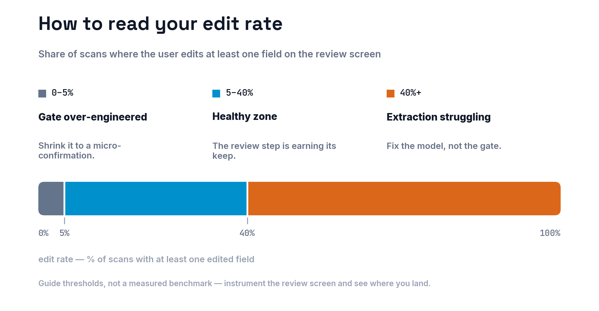
Where we skip the gate: CartWise
The same studio ships the opposite decision. In CartWise’s AI grocery list generator, you describe an occasion and the AI writes a full list. There is no review screen. The list appears, already usable, in the cart.
Same company, same instinct about AI, opposite outcome — because the error economics invert. A wrong item on a grocery list is visible in the second it appears, sits next to a delete button, and costs nothing if it survives to the store. There is no deferred cost, so a confirmation gate would be pure friction with nothing on the other side of the trade.
That is the test working correctly. The pattern is not “always confirm” or “never confirm”. The pattern is: the gate belongs where the error is expensive and quiet.
Takeaways
- Decide the confirmation step by the cost and the delay of an error, not by model confidence.
- Silent, deferred failures are the ones that kill a utility app — they destroy the only reason the app exists.
- If you keep a gate, earn it: show the source, allow in-place edits, and make confirming a reflex.
- If the error is instant and cheap to fix, the interface is the review step. Do not add a screen for it.
The receipt scanner in Claimly does the typing. The person still owns the decision — and for a feature whose only job is to be right about a date six months from now, that is not friction worth removing. If you want the user-facing version of how the scanner and warranty tracking work together, we wrote that up in the warranty scanner guide.
Frequently Asked Questions
Should an AI auto-fill feature save data automatically?
It depends on when a mistake becomes visible. If the user would notice a wrong value immediately and can fix it in one tap, auto-save is fine. If the error stays hidden until it costs something — a missed deadline, a wrong payment — keep a confirmation step.
What is human-in-the-loop AI in a mobile app?
It means the AI proposes and the person commits. The model extracts or generates the values, the interface shows them as a draft, and nothing is written to storage until the user approves. The human stays the last decision-maker.
How accurate is AI receipt scanning?
Accurate enough to save most of the typing, not accurate enough to trust blindly. The recurring failures are structural: a total that is actually a subtotal, an ambiguous date format, a store header that is a legal entity name, and faded thermal print.
How should an app show which fields the AI filled in?
Mark AI-derived values visibly, keep every field editable in place, and never hide the source document. In Claimly the scanned receipt stays on screen next to the fields so the person can compare instead of trusting.
Does the confirmation step hurt conversion?
It adds a screen, so it costs something. We accept that cost only when the error is expensive and silent. For low-stakes AI output, like a generated grocery list, we skip the gate entirely.